Pantone 2019: the trend of the moment in interior design and fashion is Living Coral
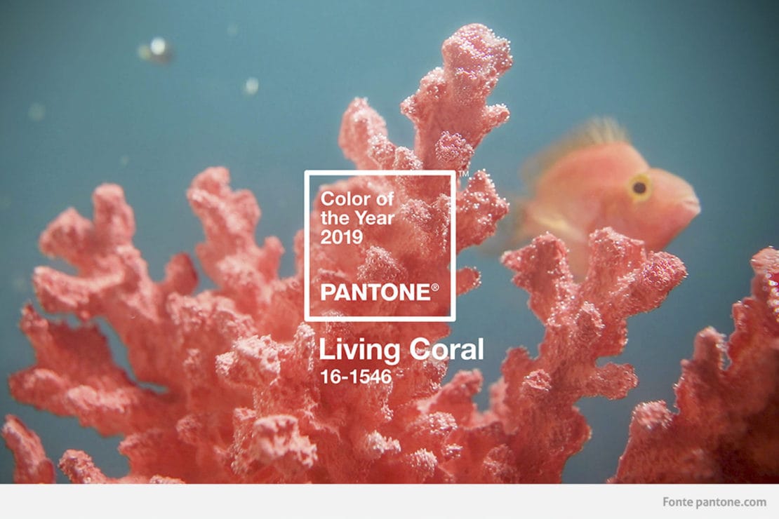
The Pantone Color Institute has announced, as it does every year, the colour that will accompany us over the next 12 months. It’s vibrant, it’s positive and it’s comforting: Living Coral, Pantone’s colour of the year 2019.
The Pantone colour of the year is chosen by a team of 20 experts who carefully monitor trends in the most varied of sectors for a whole 9 months. These sectors include art, fashion and design first and foremost, but also cover new lifestyle trends, from social media right through to tourism and technological innovation.
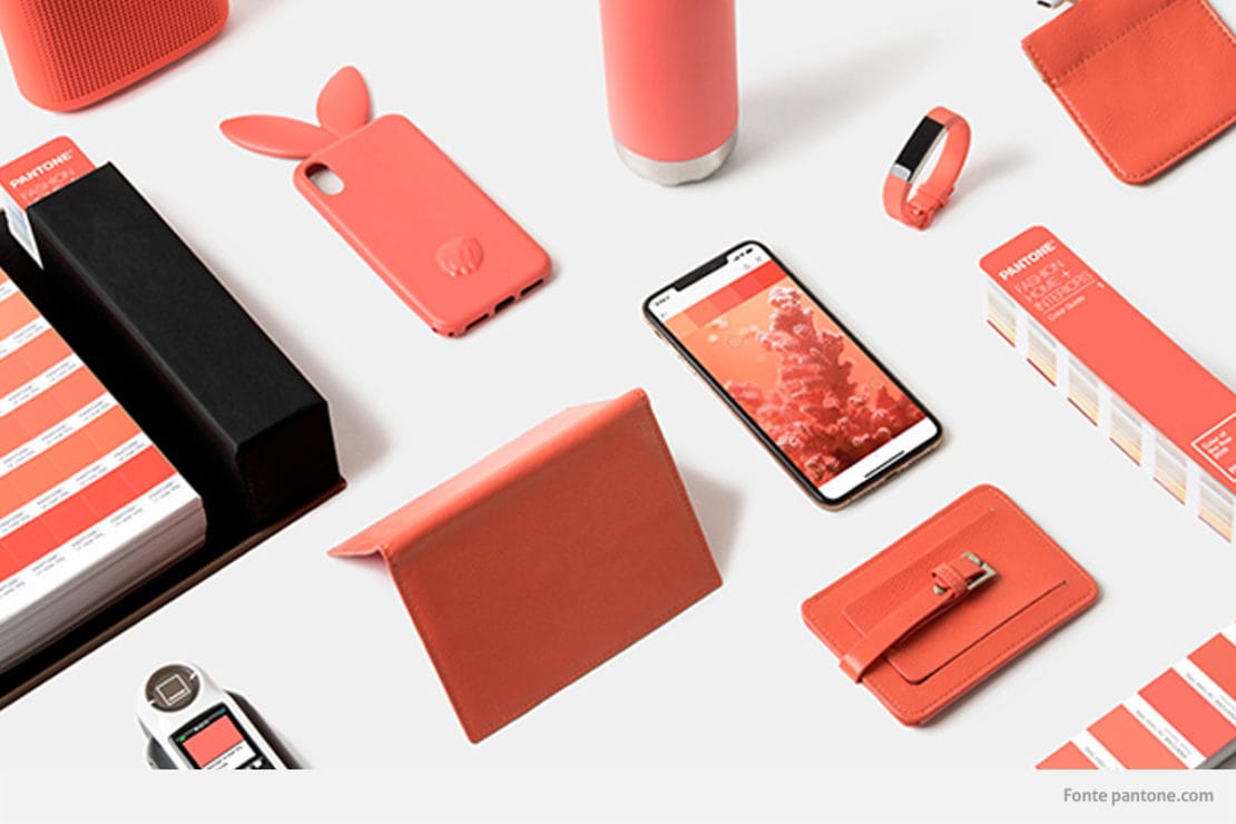
This year, Living Coral is the chosen colour: a vibrant mix of pink and orange with a hint of gold. This shade communicates a need for human contact and positivity. As Leatrice Eiseman, Executive Director of the Pantone Color Institute, explains «With consumers craving human interaction and social connection, the humanizing and heartening qualities displayed by the convivial Pantone Living Coral hit a responsive chord.»
Let’s take a closer look at the colour trends for 2019 in the world of fashion and interior design.
Pantone 2019 in fashion
For those of you who want to interpret the colour trend of the year through your outfits, we have some good news for you: the fashion world has welcomed this bright shade with open arms. Living Coral is everywhere on the catwalk for Spring/Summer 2019, with full one-colour looks or pairings that work just as well for the female wardrobe as for menswear.

If, however, this colour has already won you over, you can start using it in the winter season too: dress down a suit jacket and trousers, add a vibrant touch to your accessories, or simply flaunt it as your next shade of nail varnish!
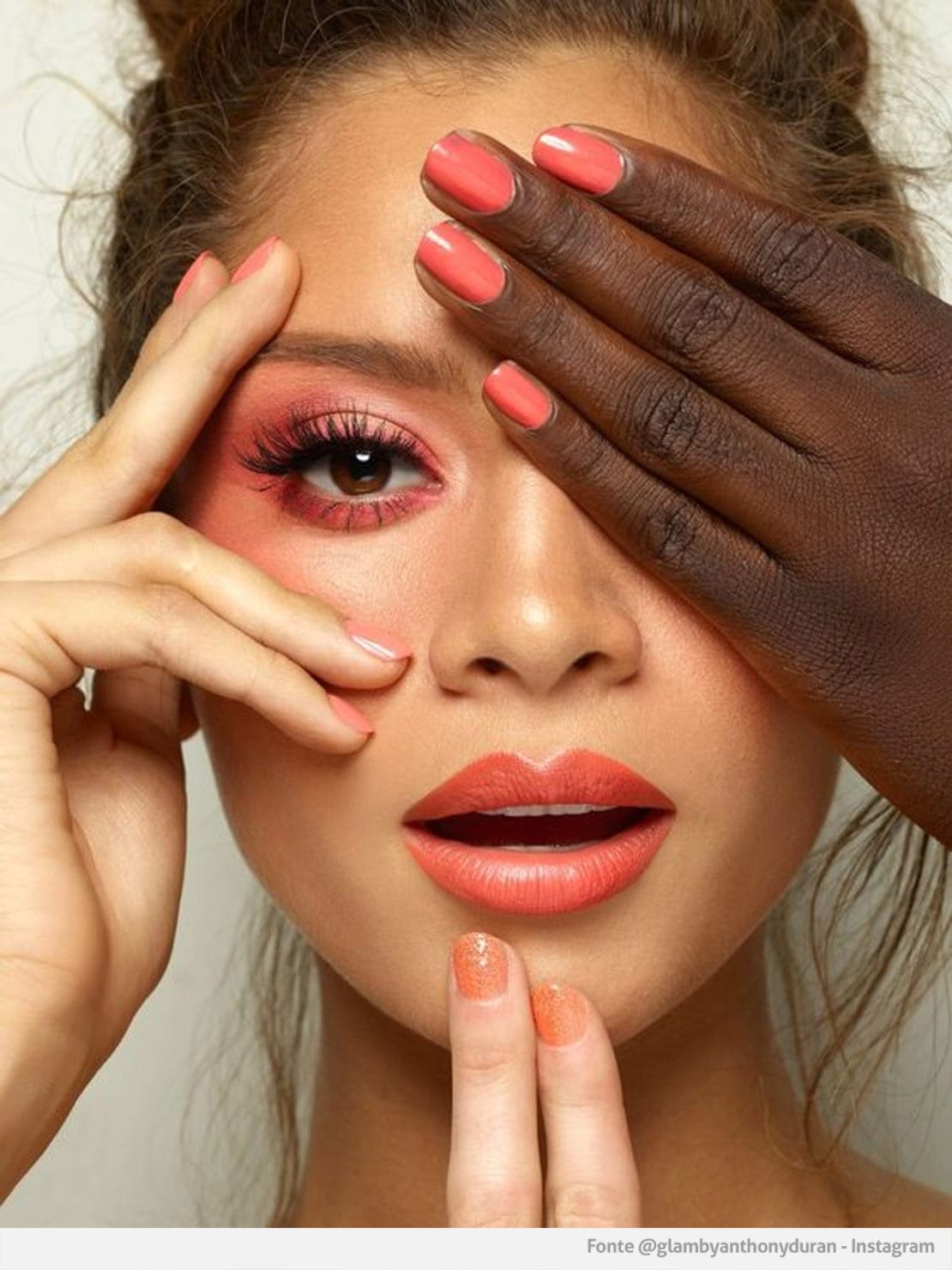
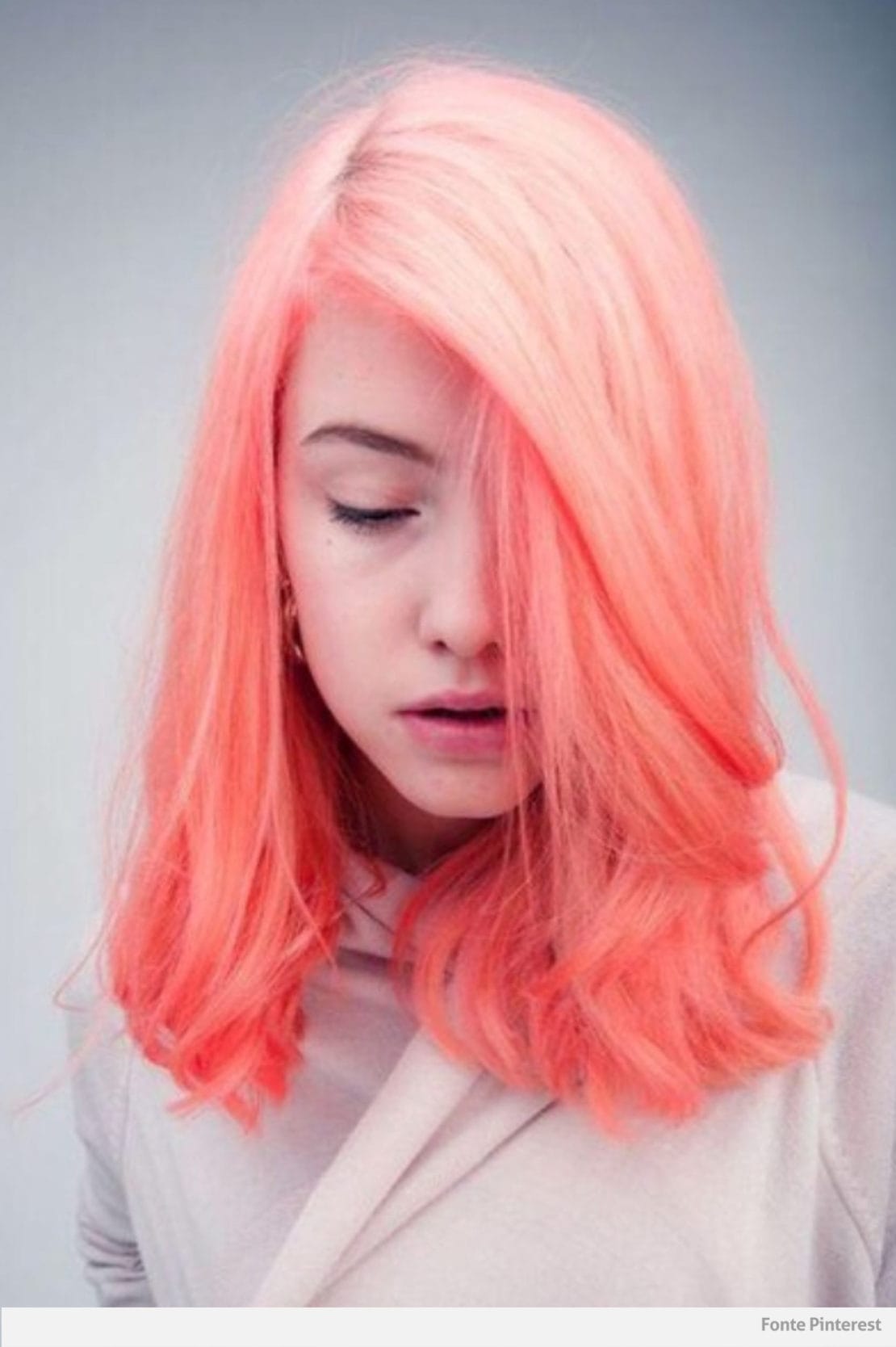
Living Coral is a big hit in the hair world too: it adds a warm, buoyant nuance that works perfectly with any eye colour and skin tone. If you want to be bold and go for a punchy shade, this is definitely the one for you!
Living Coral in interior design
Now let’s take a look at the world of design because, as you can imagine, Living Coral is among the on-trend colours for interior design in 2019. This intense, powerful shade has an optimistic, witty vein: reason enough to use it wisely in your home.
In the kitchen, the best way to insert Living Coral is to choose it for your accessories and crockery: items you can leave lying around on the table or shelves, seemingly untidily, but actually to show off your new Pantone accents! What to go for? These gorgeous coral bowls by American brand Anthropologie are sure to brighten up your breakfast, as well as your kitchen space.

There are a number of options for the living room. This colour can be used for inserts and open units, to give your neutral interiors an original twist. To bring the whole look together, opt for some tone-on-tone decorations that echo Living Coral in different corners of the space, just like in this Innova living room.

Use splashes of Living Coral for a tongue-in-cheek look, like these fun and fashionable sofas by French brand Ligne Roset.


If you are looking for a more intense effect, why not go for a full wall in Living Coral? This colour goes perfectly with cold, desaturated tones like those in the Dandy collection by Ikona. These shades complement each other and create a unique, inviting space.

If Living Coral has you hooked, all that remains is to have fun experimenting with it for your next outfit or decorating spree!