Colour and design: Interview with Stefano Spessotto

Colour needs to be planned just as much as design, and it has to meet a brand’s needs, as well as being susceptible to current trends. For the new Santalucia Mobili collections, Stefano Spessotto has chosen desaturated colours to create colourful – but not too colourful – compositions, using shades that create a harmonious effect in the specific setting and as a stand-alone palette. The designer reveals all in this interview.

What role does colour play in design?
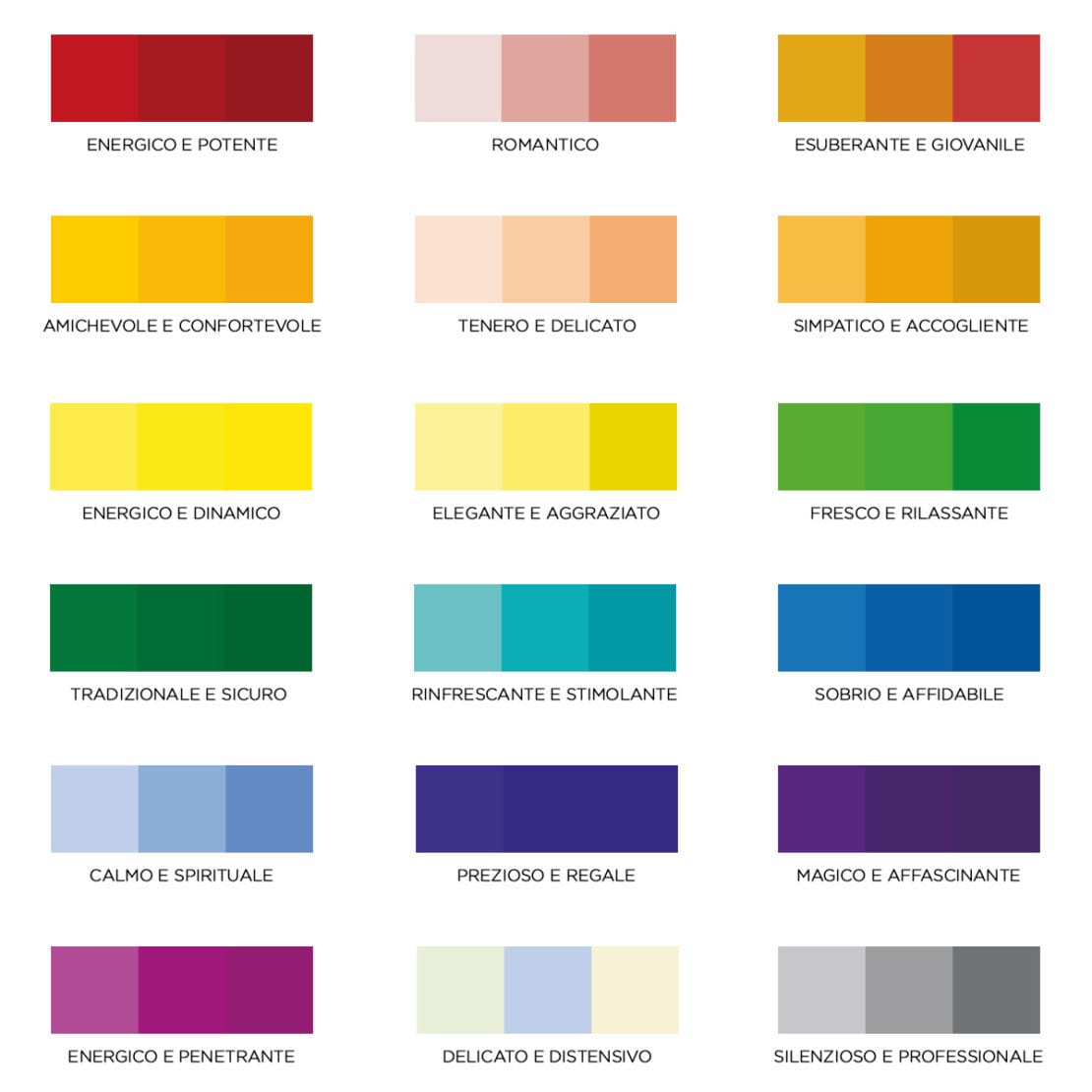
It depends on the project. In many products or projects, colour needs to be a flexible variable. Nowadays, the possibility of customising any product with any colour is paramount. Other products – very few, to tell the truth – are created to don just one particular, ideal colour. In general, I’d say that, even if there has been some sort of a comeback, colour has lost the pop nuances of the past. There are only a few pure colours (primary and secondary). The current trend for pastel or muted hues – like grey, for example – stems from the need for product versatility. These non-colours are easier to match because they move away from the basic rules, such as complementarity.
How do you create a colour palette for a brand or a collection?
For products, there are some specific instructions that guide a designer or artistic director. In general, a colour palette comes to life to enhance the main materials in a collection or a product, such as wood, natural stone, or metal. For a brand, on the other hand, it stems from what the brand wants to express. When it comes to luxury items, for example, you are unlikely to ever find a wide colour palette, which would create confusion, or non-desaturated colours. The aim is to always ensure brand recognition.

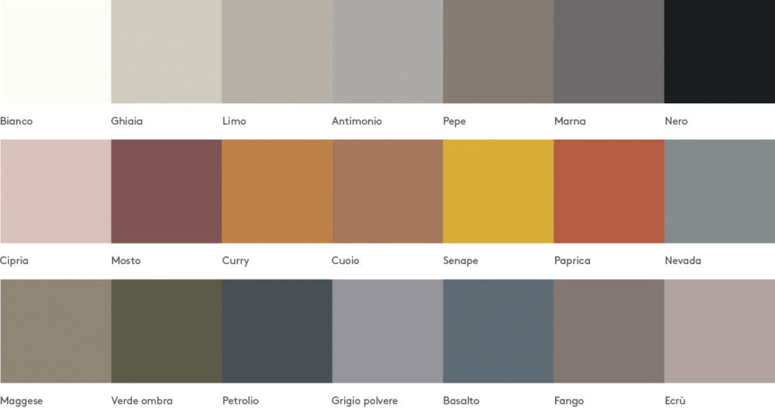
For Santalucia Mobili’s Ikona brand, you have chosen desaturated colours. What does ‘desaturated’ mean exactly?
It means non-pure colours. Not red, blue, or yellow; these are pure colours. Desaturated colours are not even secondary or tertiary colours (orange, purple, etc.). To put it simply, it means colours with a significant black, white, or grey component in the mix.
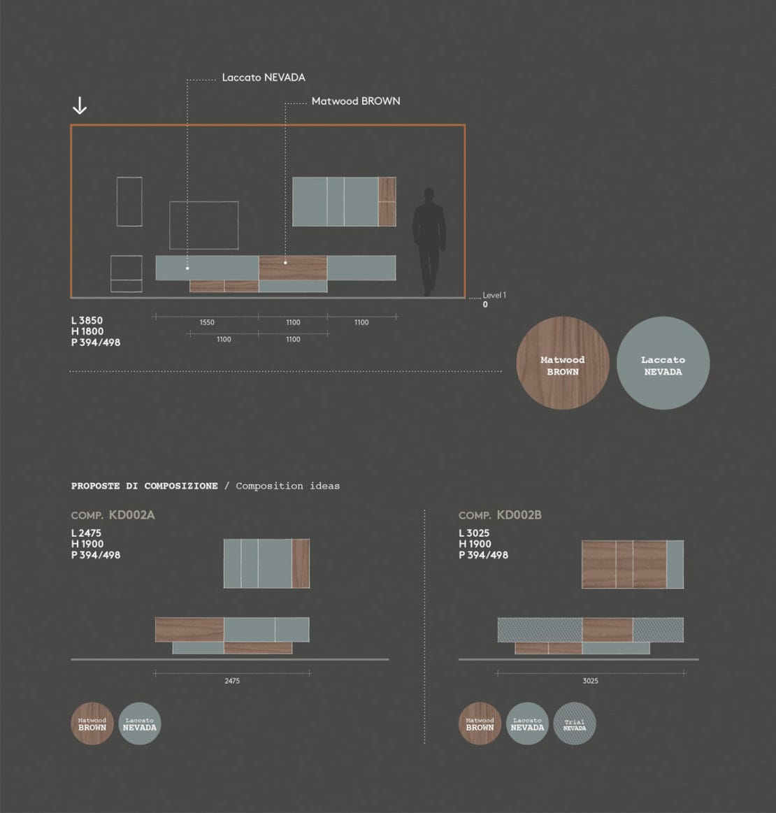
Customisation is very important for Santalucia Mobili to allow customers to create their own spaces, while guiding them in choosing the right colours and finishes. Are there any particular rules for combining colours?
By carefully selecting the colour palette, you can create compositions that are colourful without any unwanted effects, because the colours work well together. I would suggest using muted colours (like grey) or wood for larger surfaces, and brighter colours just for a few details. I would also avoid using more than 3 shades, (muted and vibrant) in the same composition. It is also important to choose colours that match your flooring.
Any predictions for upcoming colour trends?
I think that identifying upcoming colour trends is a bit like forecasting the weather for next year. I don’t think there will be any big changes in the furnishing sector in 2019, also because I really think that we will be focusing on ‘colour combination trends’ rather than just ‘colour trends’. For example, blue and black have always been there; they never grow old, but they are never new either. The two never went together – in the sartorial industry, it was once almost considered a heresy – but today, this combination is not only possible, it is quite popular. To answer your question, I predict that – although I don’t really like it – red will make a comeback in many different shades. Although I must admit I do hope to be proven wrong!
