Chromotherapy and interior design
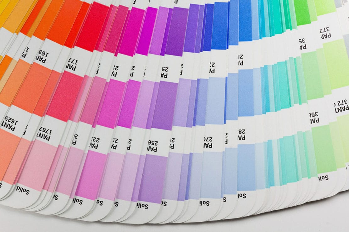
Whether energising, stress-relieving, relaxing or soothing, colours matter – and they can influence our mood. That is why it is important to choose them carefully when furnishing our homes. Some shades work better in certain rooms, others are suited to both living and bedroom spaces. Here we have chosen a handful of colours that we think are perfect for your Santalucia Mobili home.
Green: regeneration
Green is the colour that best represents nature in all of its forms; it conjures up images of lush lawns and blooming foliage, and stimulates positive emotions. It works well in any room, whether used as a block colour on the wall or as an accent in the form of plants and flowers. Paler, more delicate tones have a soothing effect, while more intense, bold shades reinvigorate mind and body.

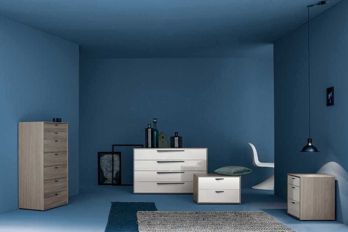
Blue: relaxation
Blue is the colour of the sea and the sky; it creates a sense of calm and relaxation. Paler tones are perfect for living spaces, especially in those rooms used for relaxing on the sofa in front of the TV, or curling up with a good book. Deeper, bolder shades are more suited to the bedroom, as they are conducive to rest.
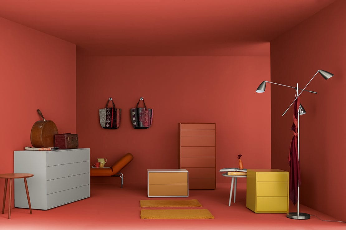
Orange: energising
Orange is a sociable colour, often associated with creativity and representative of vitamin C. It stimulates conversation, making it ideal for rooms where families and friends spend time together, as well as for areas dedicated to work or study. When combined with yellow furniture or accents, it can transform your room into an explosion of pure energy.
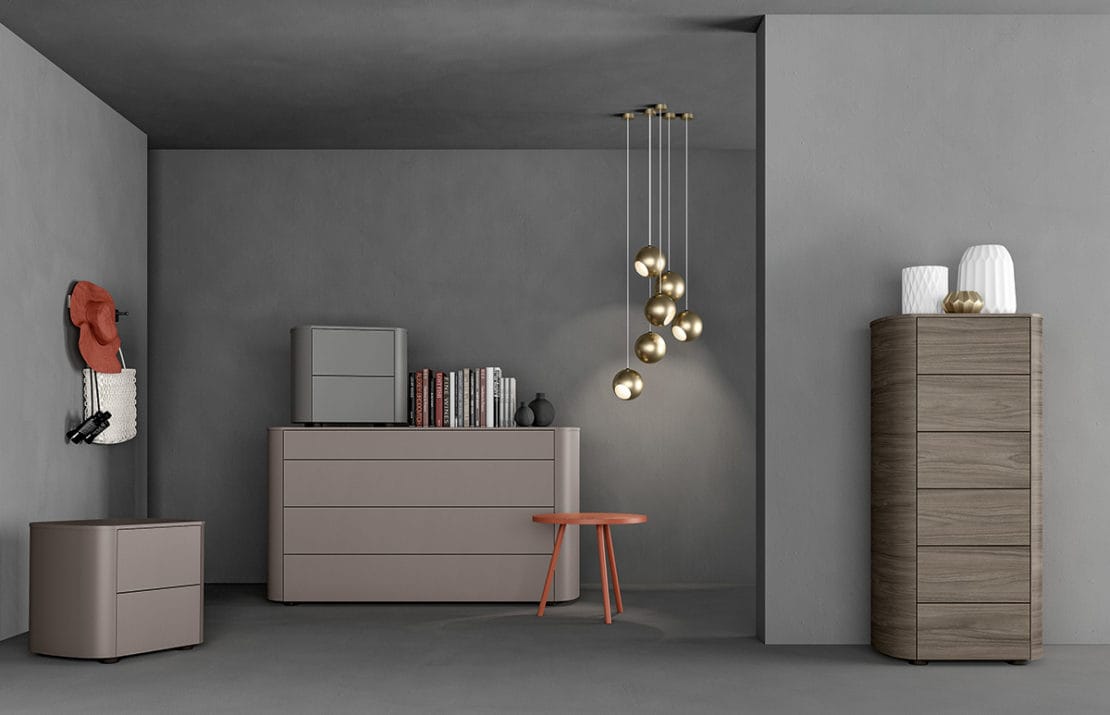
Grey: elegance
Neutral by definition and elegant in style, grey works well anywhere. Thanks to its neutral properties, it helps to bring out the furniture or other colours in the room. Don’t think of it as a sad colour! It can make the perfect backdrop for brightly coloured furniture, and a simple wood grain is all you need to warm it up. Grey is the colour of all things practical; it doesn’t distract our attention, making it perfect for rooms in the home where we study or work.
Beige: welcoming
A neutral colour, like grey but warmer, beige is reassuring and comforting. It is delicate and natural in all forms. When paired with white, it creates truly harmonious spaces. Walking into a room that uses beige for the furniture or on the walls instantly creates a sense of reassurance and really creates the feeling of space. It adapts to suit any room, from living rooms to bedrooms, and it also works perfectly in bathrooms or kitchens. So if you are not a big fan of bold, bright colours, why not start with a neutral base and introduce colour with accessories?
